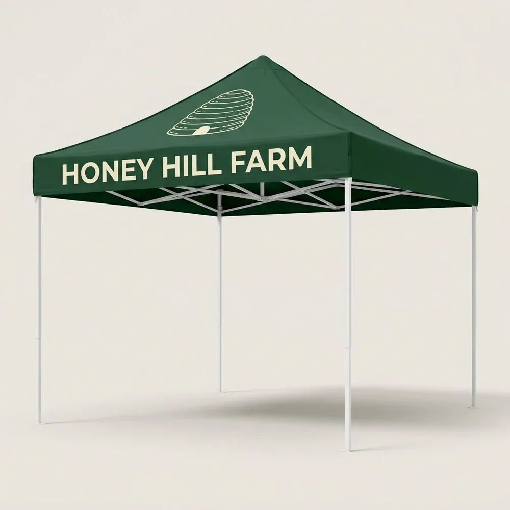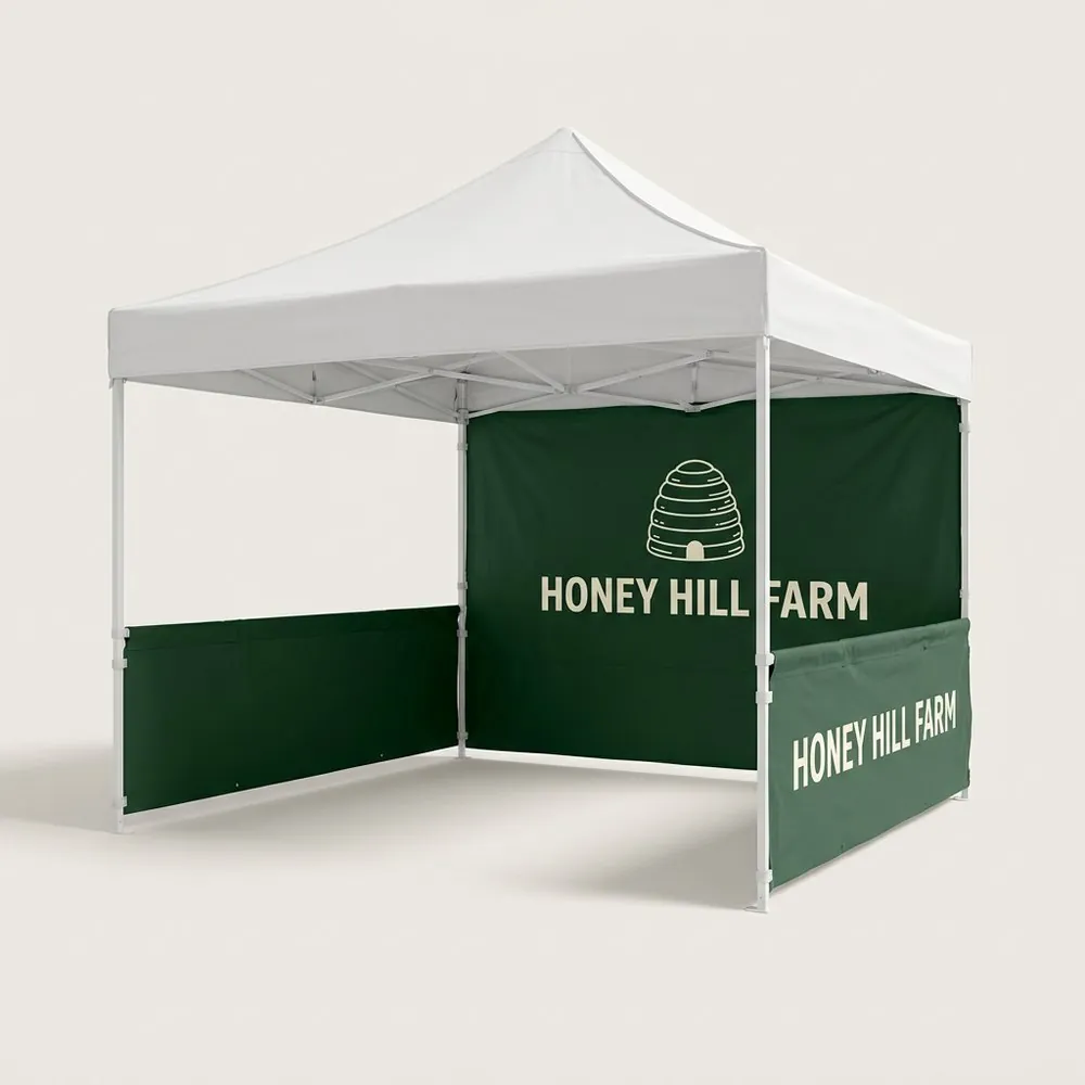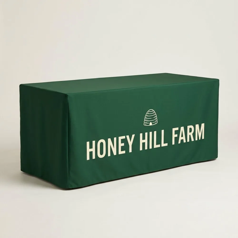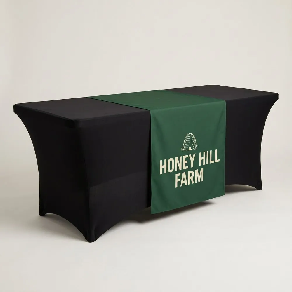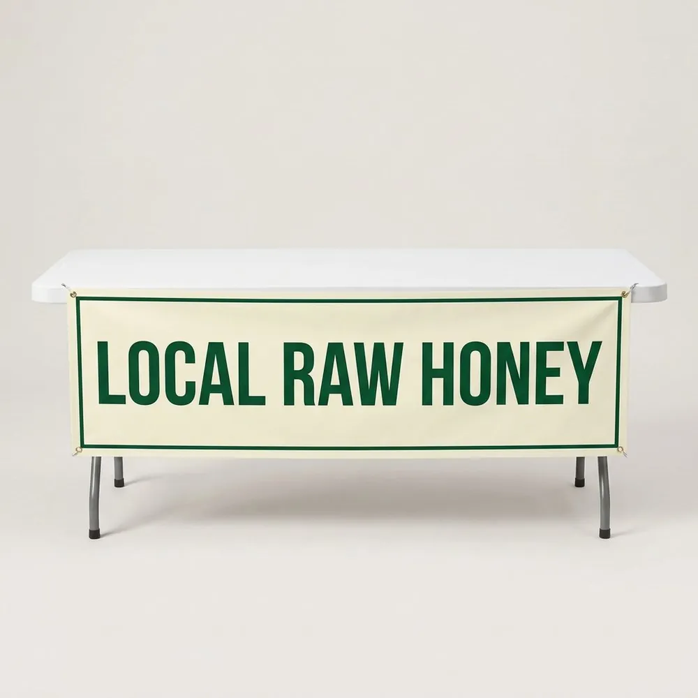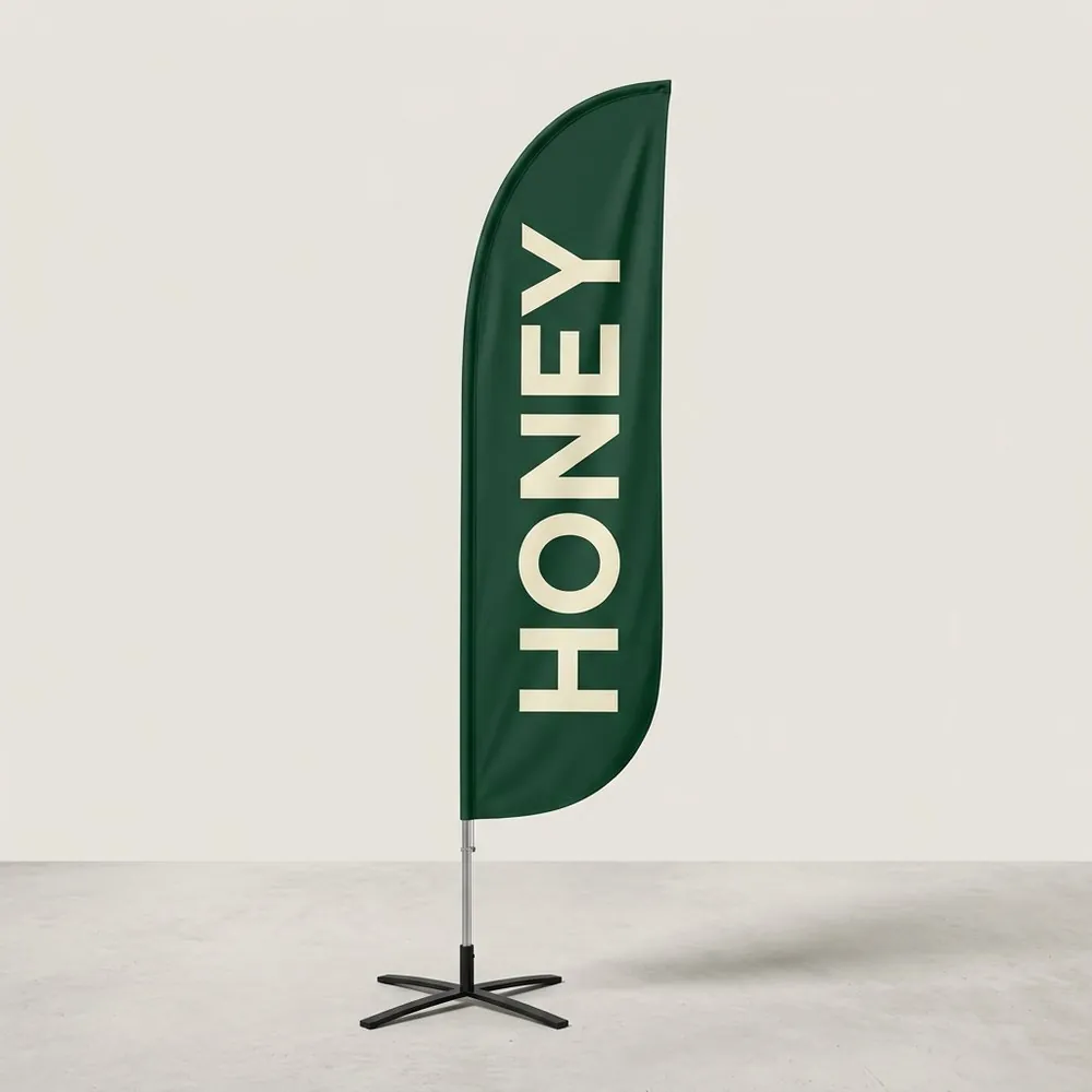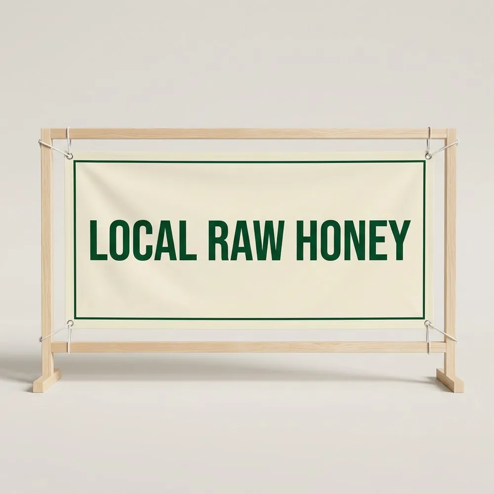
Three things, in this order
- Your name, as large as the banner allows.
- What you sell, in a few words.
- One way to find you later: a website or a handle.
Contrast
Dark letters on a light background or light letters on a dark background. Yellow on white and red on black are hard to read outdoors. If you are unsure, look at the proof with your eyes half closed. The name should still stand out.
Typeface
Use bold, plain letters. Thin script fonts look good on a business card and blur at a distance. If your logo is a script, set a plain line under it.
No logo yet
You do not need one. Type your shop name, pick a color and we set it in clean capital letters on the proof.
Common mistakes
- Too many words. Every extra line makes the name smaller.
- A photo background behind the text.
- Text too close to the edges, where the hems and grommets are.
- Dates and prices that make the banner out of date.